-

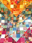
- Two Quilts by Liz.
-
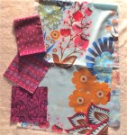
- Big and Little Prints Create Visual Interest
-
- Liz’s Quilt with Color Design and ‘Pops’ of White
Liz shared her passion for color and quilts at our last meeting. Inspired by Anna Maria Horner (see her website here) we learned about choosing prints and colors. Anna Maria compares buying clothes to buying fabric and if you know what you like then you should trust yourself . . . sort of. If you’re not totally confident in your own sense of color or want to try something new then follow some of Anna Maria’s recipes as presented by Liz:
First figure out if your fabrics are in the Cool Color Family (blues, greens, purples and teals) or Warm Color Family (reds, oranges, yellows, pinks, rusts, and warm browns).
- Recipe 1 – Monochromatic. Work with one color family. Try small prints next to large prints.

Warm and Cool Color Families
- Recipe 2 – Monochromatic with an Accent. Use mostly one color family with little additions of an accent family to “pop” the visual interest.
-
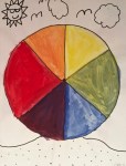
- Liz’s Color Wheel Helps Identify Complementary Colors
-
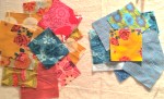
- Monochromatic Colors with Accent
-

- Liz’s Warm Colored Circle Quilt with Blue Accent
- Recipe 3 – Multicolored. Use a multicolored fabric you really like. Add a solid or different print.

Triangle Quilt Using Related Colors by Liz
